Walk into any premium office — a law firm, an architect's studio, a CEO's home study — and you'll notice something immediately. It doesn't look expensive because of the art on the walls or the colour palette. It looks expensive because of the surfaces.
Most people trying to upgrade their home office focus on the wrong things. They buy a new lamp. They cable-tie the wires. They hang a print. None of it works, because the desk — the thing that takes up 40% of your visual field — is still a €150 laminate board on adjustable legs.
This guide covers what actually moves the needle. Six things, in order of impact.
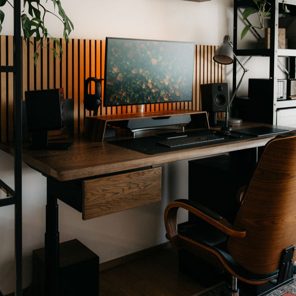
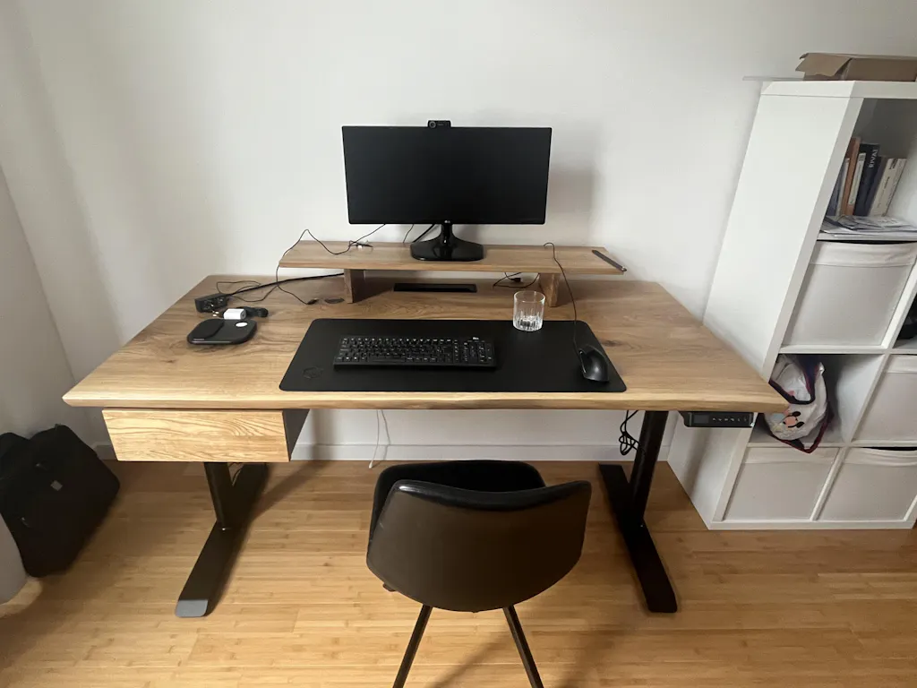
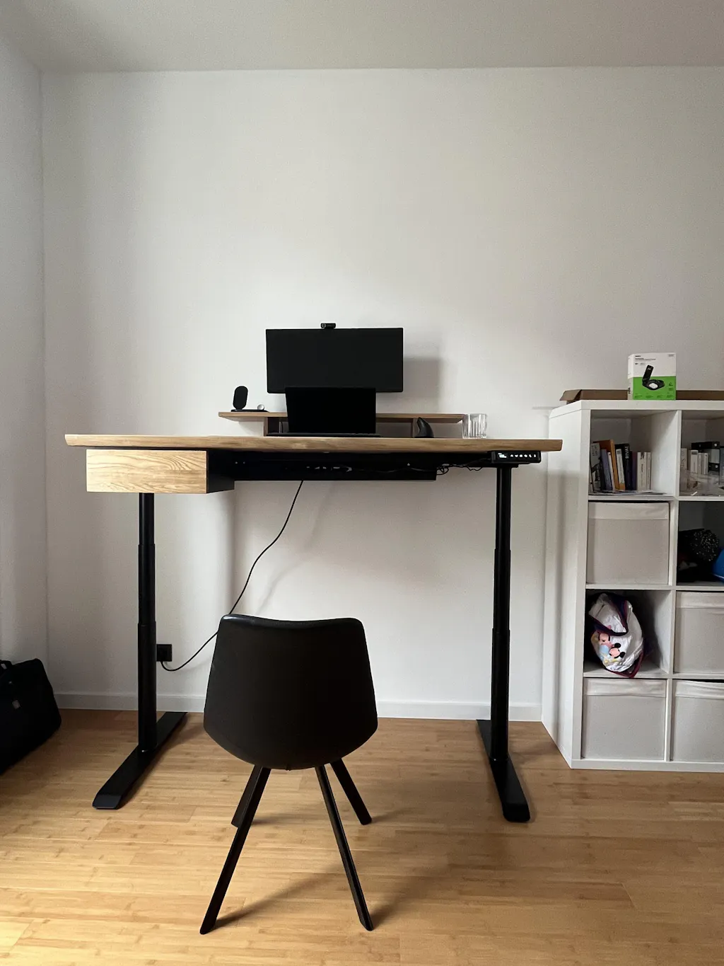
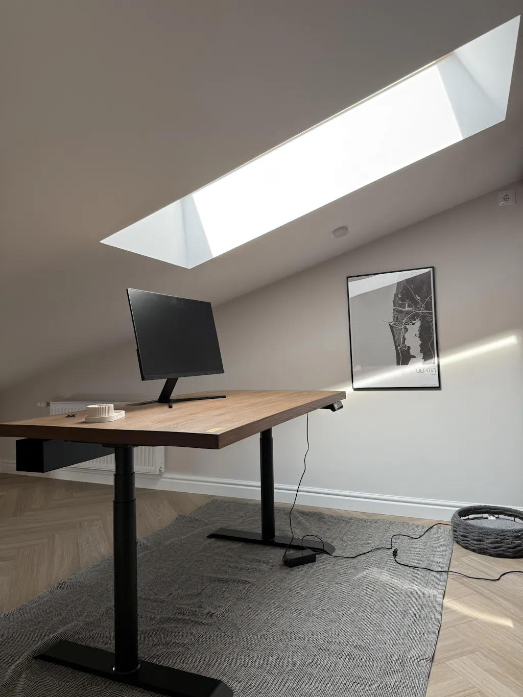
1. The desk surface is 80% of the visual impression
Your desk is not a background element. It's the centrepiece. It's what's in frame on every video call. It's what your eye lands on when you walk in the room.
Laminate and MDF have a specific visual quality — uniformity. Every square centimetre looks identical, because it was printed that way. The brain reads this as manufactured, cheap, disposable.
Solid oak works the opposite way. The grain shifts. The knots are where they grew. No two boards look the same. The brain reads this as made, as real, as something that took time. This isn't aesthetic preference — it's a materials literacy that most people have without knowing they have it.
If you do one thing to make your home office look expensive: replace the surface. Everything else is secondary.
→ OAKO's Solid Oak Desk is available in three finishes — Golden Crust, Mahogany, and White Mist — each cut from a single slab of European oak.
2. Cable chaos is the #1 thing that makes setups look cheap
You can have a €3,000 monitor, a beautiful desk, and a designer chair — and one power strip sitting on the floor will undo all of it.
Visible cables are the fastest way to make a workspace look improvised. Not because cables are ugly in themselves, but because they signal that nobody thought about the setup. Intentionality is what expensive looks like.
Fix it in this order:
- Under-desk cable tray first — gets the power strip and surge protector off the floor and out of sight
- Cable spine or sleeve for monitor and laptop cables running vertically
- Velcro ties, not zip ties — you'll be reconfiguring, and zip ties make that annoying
Once cables are gone, the desk surface has room to breathe. That emptiness reads as luxury.
→ OAKO's Cable Tray mounts underneath the desk surface with no visible hardware from above.
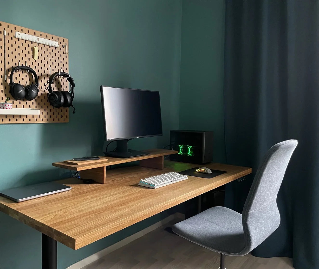
3. Monitor height changes the entire composition
A monitor sitting flat on the desk looks like a computer. A monitor elevated to eye level on a solid oak stand looks like a workstation.
The height change does two things: it improves ergonomics — less neck strain — but more importantly for the visual impression, it creates layers in the setup. Foreground (keyboard, mouse), midground (stand, small items), background (monitor, wall). Depth reads as considered.
A cheap monitor riser or stack of books undermines the effect. The stand material matters — it needs to match or complement the desk surface. An oak stand on an oak desk creates visual continuity. That continuity is what makes a setup look like it was designed rather than assembled.
→ OAKO's Mini and Large Monitor Stands are solid oak — matching the desk grain family.
4. One wall behind you is worth more than everything on your desk
For anyone on video calls, the wall behind you is a second workspace. It's what colleagues, clients, and managers see for every hour you're on screen.
A plain white wall with one IKEA print looks like a rental apartment. A wall with a single large piece — an oversized print, a floating shelf with three considered objects, a section of textured wallpaper — looks like someone lives there intentionally.
The rule: less is more, but what's there must be large enough to register on camera. Small items disappear. One large item dominates — and dominating is what expensive looks like.
5. Lighting has a direction problem, not a brightness problem
Most home offices are lit from above — ceiling light, maybe a ring light. Overhead light is flat. It kills shadow. It makes everything look the same brightness, which reads as cheap.
Expensive-looking spaces use directional light. A desk lamp that throws light from the side. A floor lamp behind the monitor. Light that creates shadow creates depth, and depth creates the impression of quality.
Colour temperature matters too: warm (2700–3000K) for a human, premium feel. Cool (5000K+) for a clinical, tech setup. Neither is wrong — but mixing them randomly looks bad. Pick one and commit.
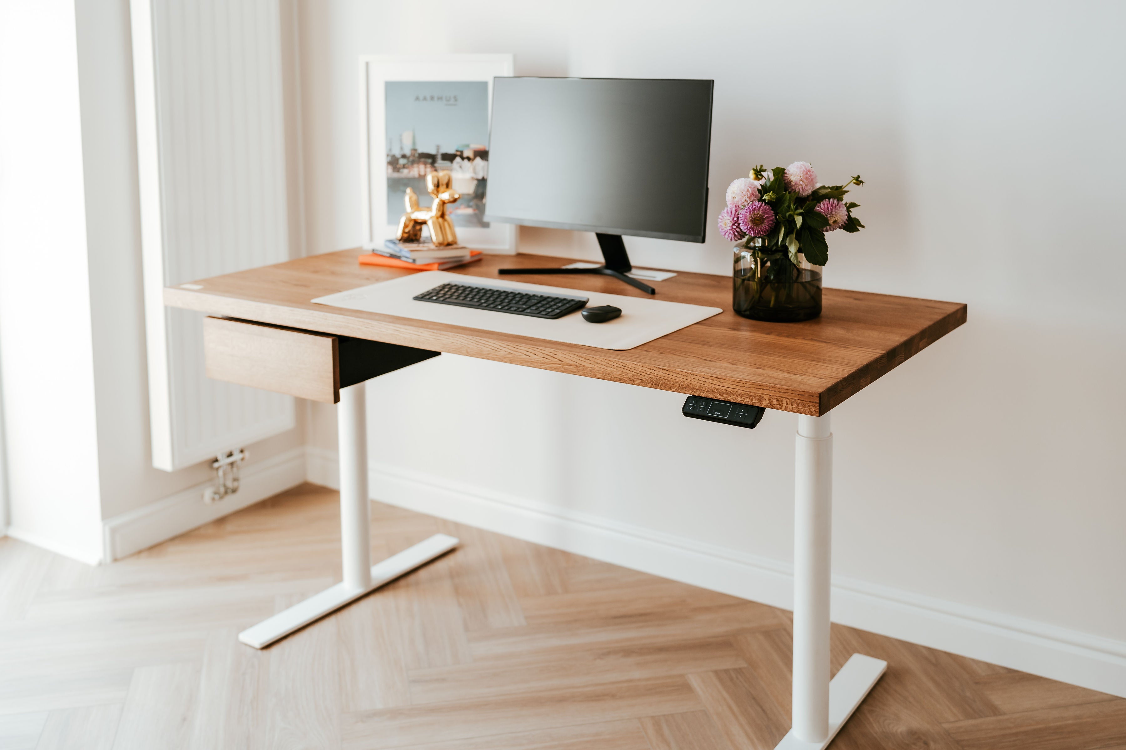
6. Negative space is a luxury material
What's not on your desk matters as much as what is.
The difference between a €500 setup and a €5,000 setup is often not what's been added — it's what's been removed. The coffee mug. The stack of papers. The second monitor nobody uses. The charging cables. The sticky notes.
Expensive setups have empty desk surface. That emptiness signals that the person who works here has systems — storage, organisation, intention. Clutter signals the opposite.
A solid oak desk with nothing on it except a laptop, a notebook, and a glass of water looks like something from an architecture magazine. The same desk covered in objects looks like everyone else's desk.
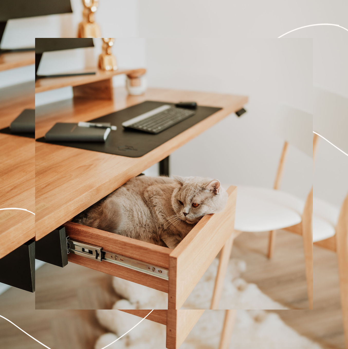
Start by removing. Then add back only what earns its place. The Mino Oak Drawer helps — it keeps essentials accessible but off the surface entirely.
Start with the surface
Making your home office look expensive isn't a budget question — it's a priorities question. Most people spend money on the wrong things: decorative items, desk accessories, plants. The setup still looks cheap because the surface is laminate and the cables are visible.
Fix the fundamentals first. Start with the desk.
```

Leave a comment
This site is protected by hCaptcha and the hCaptcha Privacy Policy and Terms of Service apply.